

目次
border-radiusとは?
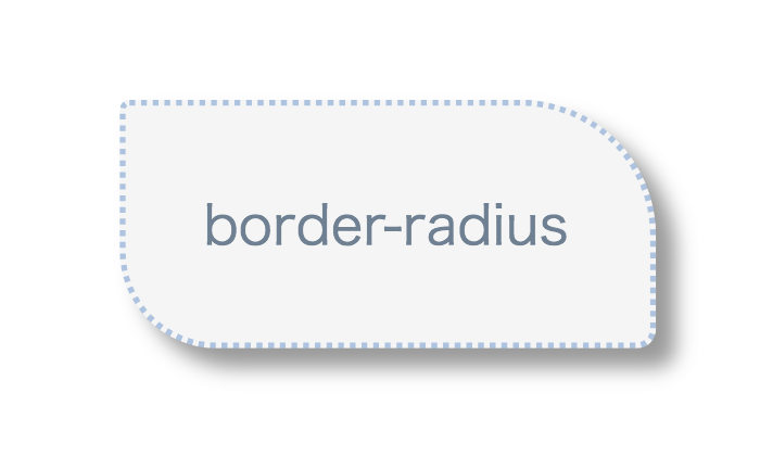
border-radiusプロパティはコンテンツの角の丸さを調整できるCSSプロパティです。上下左右の角に対して別々の角の丸さで指定する事ができます。
ボックスコンテンツの角を丸くする事で読者に柔らかい印象を与える事ができます。
border-radiusの使い方
border-radiusプロパティでは、各角に対して相対値(%,em,rem)や絶対値pxを指定して角の丸さを指定する事ができます。今回は絶対値pxで紹介します。
border-radiusの基本的な使い方
各角に対して値を一つずつ指定した場合、正円の半径に指定値が反映され、正円の中心点を基にして角が生成されます。
イメージ
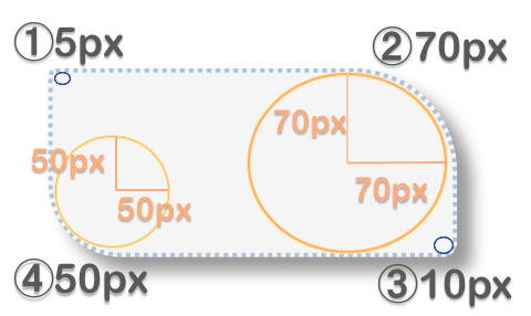
 css
div{
border-radius: 5px 70px 10px 50px;
}
ポイント
border-radius:①px②px③px④px;
- ①左上角
- ②右上角
- ③右下角
- ④左下角
border-radiusの応用的な使い方
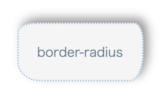
各角に対して値を4つ指定すると正円の半径が指定され角が生成されました。各角に対して水平方向の半径4つと垂直方向の半径4つ、計8つの値を指定すると楕円を基にして角を生成する事ができます。
Web表示
イメージ
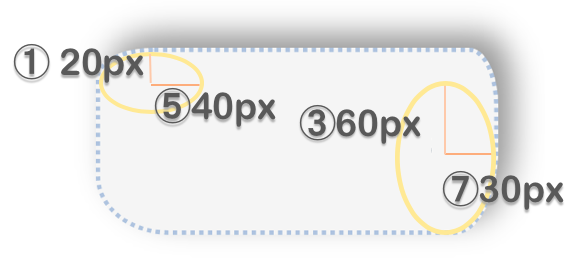
 css
div{
border-radius: 40px 20px 30px 50px / 20px 40px 60px 40px;
}
ポイント
border-radius:①px②px③px④px
/ ⑤px⑥px⑦px⑧px ;
- ①左上:水平方向の半径の指定
- ②右上:水平方向の半径の指定
- ③右下:水平方向の半径の指定
- ④左下:水平方向の半径の指定
- ⑤左上:垂直方向の半径の指定
- ⑥右上:垂直方向の半径の指定
- ⑦右下:垂直方向の半径の指定
- ⑧左下:垂直方向の半径の指定
border-radiusデザインパターン
border-radiusプロパティを使うことにより角を角丸にしたり、正円のコンテンツや不規則な角のコンテンツを作ったりすることができます。
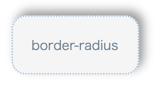
角を角丸にする(基本の角丸)
各角を同じ丸さの角にする場合は、border-radiusプロパティで一つ値を指定すれば上下左右の角が指定値の丸さになります。
Web表示
ポイント
- border-radius: ①px;
一つの値のみ指定した場合は、全ての角に適用されます。
 html
<body>
<div>border-radius</div>
</body>
 css
div{
border-radius: 30px;               /*全ての角の丸さを30pxに指定*/
box-shadow: 10px -10px 20px 0px rgba(0,0,0,0.4); /*右上に影を生成*/
background-color: #f5f5f5;      /*コンテンツの背景色を薄いグレー色に指定*/
padding: 40px;                      /*コンテンツの文字と枠線の間の余白を40pxに指定*/
width:190px;                            /*コンテンツの横幅を190pxに指定*/
color: #708090;                        /*文字の色をslategrayに指定*/
font-size: 28px;                         /*フォントサイズを28pxに指定*/
border:dotted #b0c4de;            /*枠線を点線で色をlightsteelblueに指定*/
}
正円
Web表示
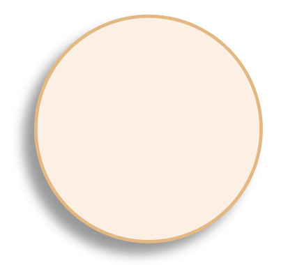
ポイント
border-radiusプロパティで各角に対して50%を指定すると正円になります。
 html
<body>
<div class="brclass2">border-radius</div>
</body>
 html
.brclass2{
border-radius: 50%;
box-shadow: -10px 10px 10px 0px rgba(0,0,0,0.4);
border: solid #deb887;
width:200px;
height:200px;
background-color: #faf0e6;
color: #deb887;
font-size: 30px;
margin:100px;
}
一部を角丸にする
Web表示
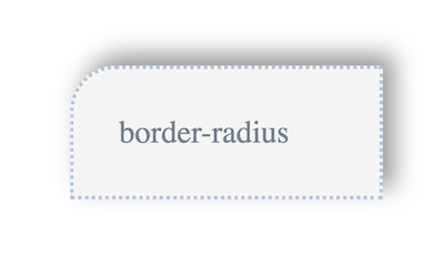
ポイント
border-radius:左上 右上 右下 左下;となるので左上(指定角)を丸みに応じて値を設定し、他を0pxとしましょう。
 html
<body>
<div class="brclass4">border-radius</div>
</body>
 css
.brclass4{
border-radius: 40px 0px 0px 0px;
box-shadow: 10px -10px 20px 0px rgba(0,0,0,0.4);
background-color: #f5f5f5;
padding: 40px;
width:190px;
color: #708090;
font-size: 28px;
margin:100px;
border:dotted #b0c4de;
}
角が不規則の円にする
Web表示
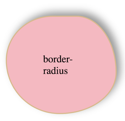
ポイント
角が不規則な円をデザインにするには、
border-radius:①%②%③%④%
/⑤%⑥%⑦%⑧% ;
で円の各角の丸さの指定を行なっていきます。
 html
<body>
<div class="brclass6">border-radius</div>
</body>
 html
.brclass6{
border-radius:70% 60% 85% 80%/75% 95% 70% 90%;
boxshadow: 10px -10px 20px 0px rgba(0,0,0,0.4);
background-color: #ffb6c1;
padding:100px;
width:100px;
color: black;
font-size: 28px;
margin:100px;
border:solid #deb887;
}
吹き出しのようなデザイン
Web表示
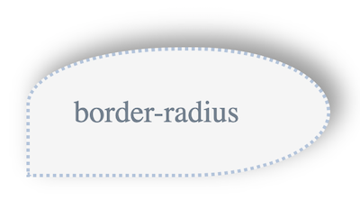
ポイント
吹き出しのようなデザインにするには、
border-radius:①%②%③%④%
/⑤%⑥%⑦%⑧% ;
を使って角の指定を行なっていきます。
 html
<body>
<div class="brclass8">border-radius</div>
</body>
 html
.brclass8{
border-radius: 90% 80% 85% 0%/80% 90% 90% 20%;
box-shadow: 10px -10px 20px 0px rgba(0,0,0,0.4);
background-color: #f5f5f5;
padding: 40px;
width:190px;
color: #708090;
font-size: 28px;
margin:100px;
border:dotted #b0c4de;
}
-

-
CSS3とは?CSSとの違いは?
続きを見る
まとめ
border-radiusプロパティを使ってコンテンツの角の丸さを指定する方法をご紹介しました。細かく指定することで不規則な円や各角の丸さが異なるコンテンツをデザインしました。まとめを記載します。
- コンテンツの各角同じ丸さで指定する場合
- border-radius: ①px;
- コンテンツの各角異なる丸さで指定する場合
- border-radius:①px②px③px④px;
- コンテンツの各角不規則な丸さで指定する場合
- border-radius:①px②px③px④px / ⑤px⑥px⑦px⑧px ;